
![7 Best AI Coding Assistants In 2023 [Free + Paid]](jpg/16952882603blllo1oza.jpg)
![30 Cool, Easy & Fun Python Projects + Source Code [2023]](png/1655865129yuz5v1mdab.png)

![The 14 Best TensorFlow Courses in 2023 [Free + Paid]](png/1624550510xonrryd0t0.png)
![10 Best Design Books for Design Students [Updated]](png/1642872008wcnbdsvf6q.png)
![I Ranked the Top 5 Best AI Image Generators [with Image Examples]](jpg/1682848644stltm9ynp6.jpg)

What is Interaction Design (IxD)
Interaction Design (IxD) is the design of responsive products and services in which a designer's focus goes beyond the item in development to include the way users will interact with it. Thus, scrutiny of users' needs, contexts, and limitations, etc. Creating the conversation a product or system has with its users. The main aim is not to make it awkward as natural discussions are the best. People assign human traits to their software products- so you may as well design for it.
Why IxD & User Experience (UX) work together?
UX design has three overlapping concerns:
- FORM: Industrial designers, Graphic design
- BEHAVIOR: Interaction designers
- CONTENT: Information Architects, Copywriters, Animators, Sound designers
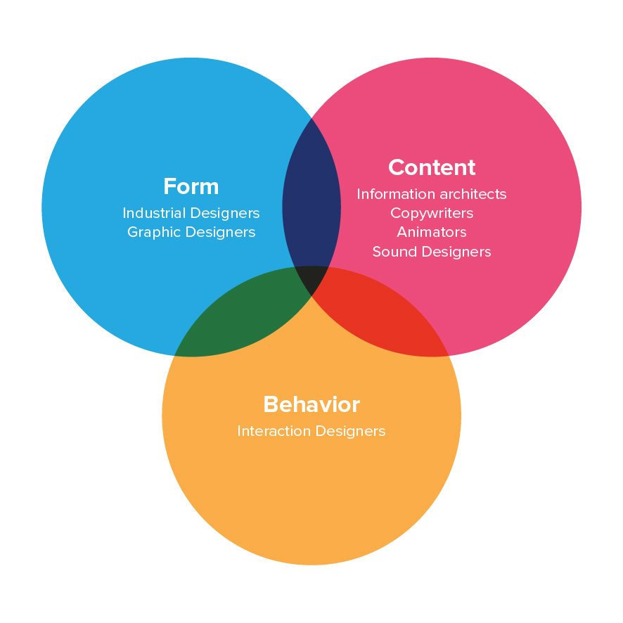
Interaction design focuses on the design of behavior but also is concerned with how that behavior relates to the content. Information architecture focuses on the structure of content and how the content is presented to the user. Industrial design and graphic design are concerned with the form of products and services but also must ensure that their form supports usage, which requires attention to behavior and content.
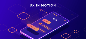
UX In Motion
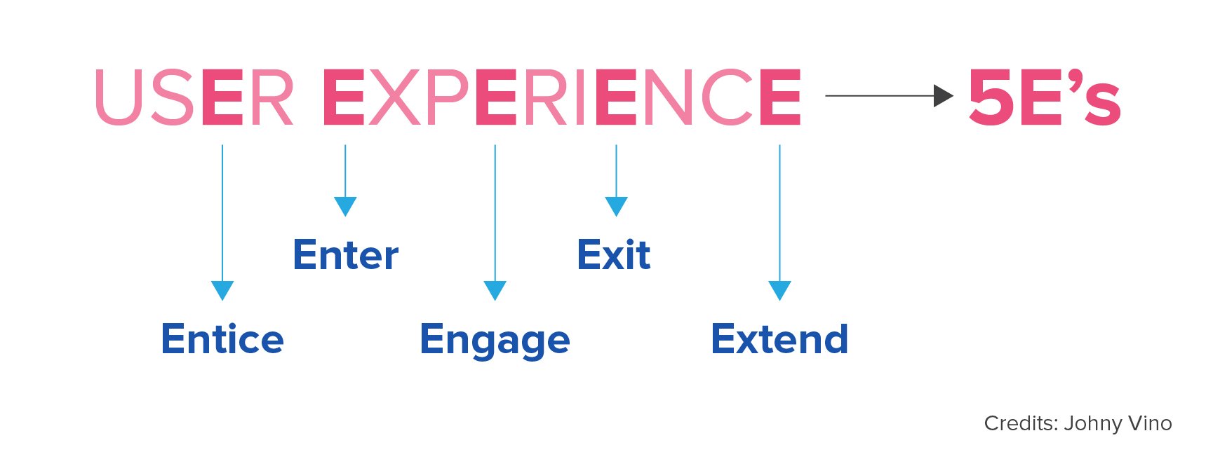
UX gives the user what they NEED, not what they WANT because the user generally doesn’t know what they need. User Experience Design is often used synonymously with terms such as “Usability” and “User Interface Design”. While Usability and User Interface Design are essential aspects of UX Design, they are subsets of it. User Experience design covers a vast array of other areas, too. A UX designer is concerned with the complete process of acquiring and integrating a product, including aspects of branding, design, usability, and function. It is a story that begins before the device is even in the user’s hands. The user experience is based on the five fundamentals, as mentioned below:
- Entice - Make user aware and curious about your product/brand/thinking
- Enter - Onboard user for a pleasant experience
- Engage - Keep user interested and hooked, basically give a response to user needs.
- Exit - Provide exit to the user, don’t just tell them
- Extend - Once the product is made, real work starts now!!
It is essential to walk with a guideline while working with UX. Four laws can help you in making a good UX for users for Mobile and Web application:
Motion Design with Figma: Animations, Motion Graphics, UX/UI
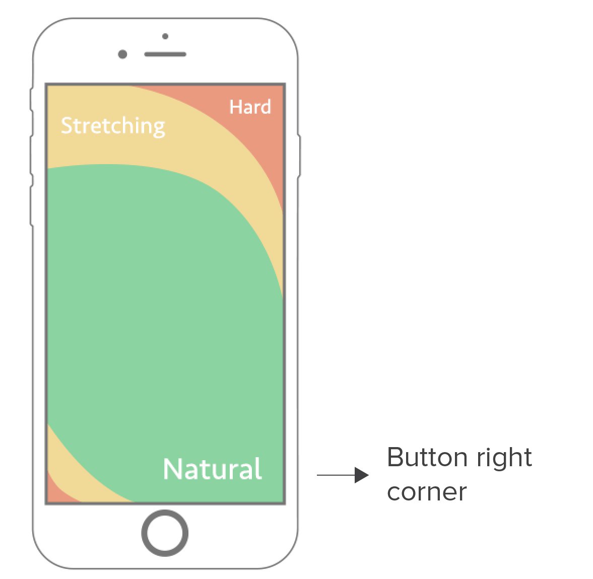
1. FITT’S Law on Touch Screen Mobile Apps
According to the FITT’S Law, keep components of action in the natural habitat of the user. Similarly, on mobile, keep CTA’s around the Natural Area (bottom right corner) and follow other secondary actions in the Stretching Area (Midbody of the screen) and Hard zone (least critical or for menu, etc.).
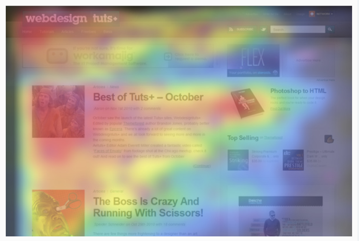
2. F-Layout on Web
The F-Layout depends on various eye-tracking studies for it's a fundamental concept. The scientific studies show that web users read the screen in an "F" pattern - seeing the top, then the upper left corner and left sides of the screen most... rarely looking towards the right side of the screen.
3. Mimicry
Take the example of physical objects which are familiar to the user to drive inspiration. Graphic design real object colors and shadows help the user feel practical and understandable. Think about the button on the web as ON and OFF switch button in real life, and how fast that happens. The same goes for your mobile lock and unlocking.
E.g., Music on tv and radio for music apps
4. Aesthetic-Usability effect
The user perceives an attractive product as more comfortable to use than a visually less appealing one. You can be bold and colorful, but do not forget to make sense. Aesthetics merely refer to the visual appeal of a product.
Motion
Motion is the next level of technology. It’s an organic way of interacting with things, and it’s critical to the design of the future. Motion tells stories — it tells how an app is organized and what all it can do. Motion drives the complete UI — it redefines navigation and generates a more natural experience by the addition of a new level of depth to the interaction design. For every button clicked and screen transition, there is a story that follows, and good motion-based design helps you to tell it.
Purpose of creating meaningful animations is User Interface
1. Orientation & Continuity
To reinforce mental models of the interface and show how content is related.
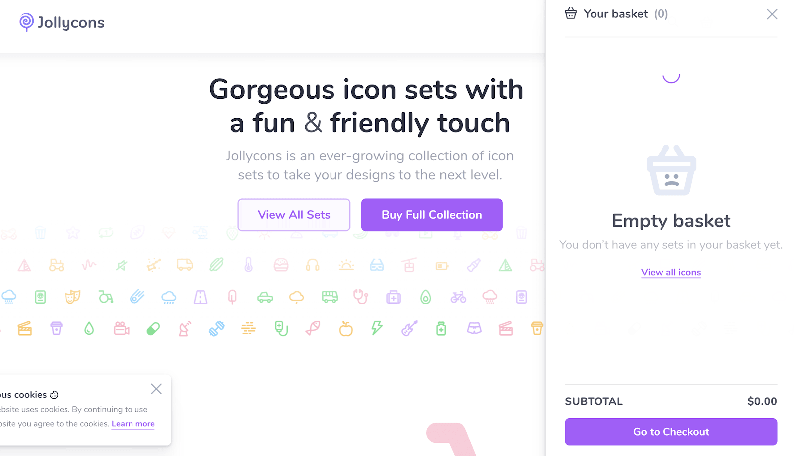
E.g.
- The simple flow of how bucket appear on jollycons when you click to buy the full collection
- Trello side menu hidden behind the icon
2. Visual Continuity
Maintaining the “Thingness” of an object through points of transition that works well with gestures.
- Google font - try to change the color
![]()
![]()
![]()
- On the iPhone, a camera icon is placed just next to a swipe gesture to make the user believe the camera is there.
3. Feedback
Letting users know that something has happened or is happening.
- Time as space - animated button on the web
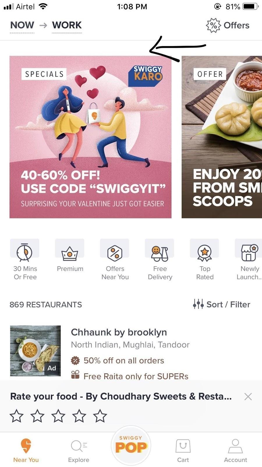
- Payments on the app ( Swiggy payment success screen )
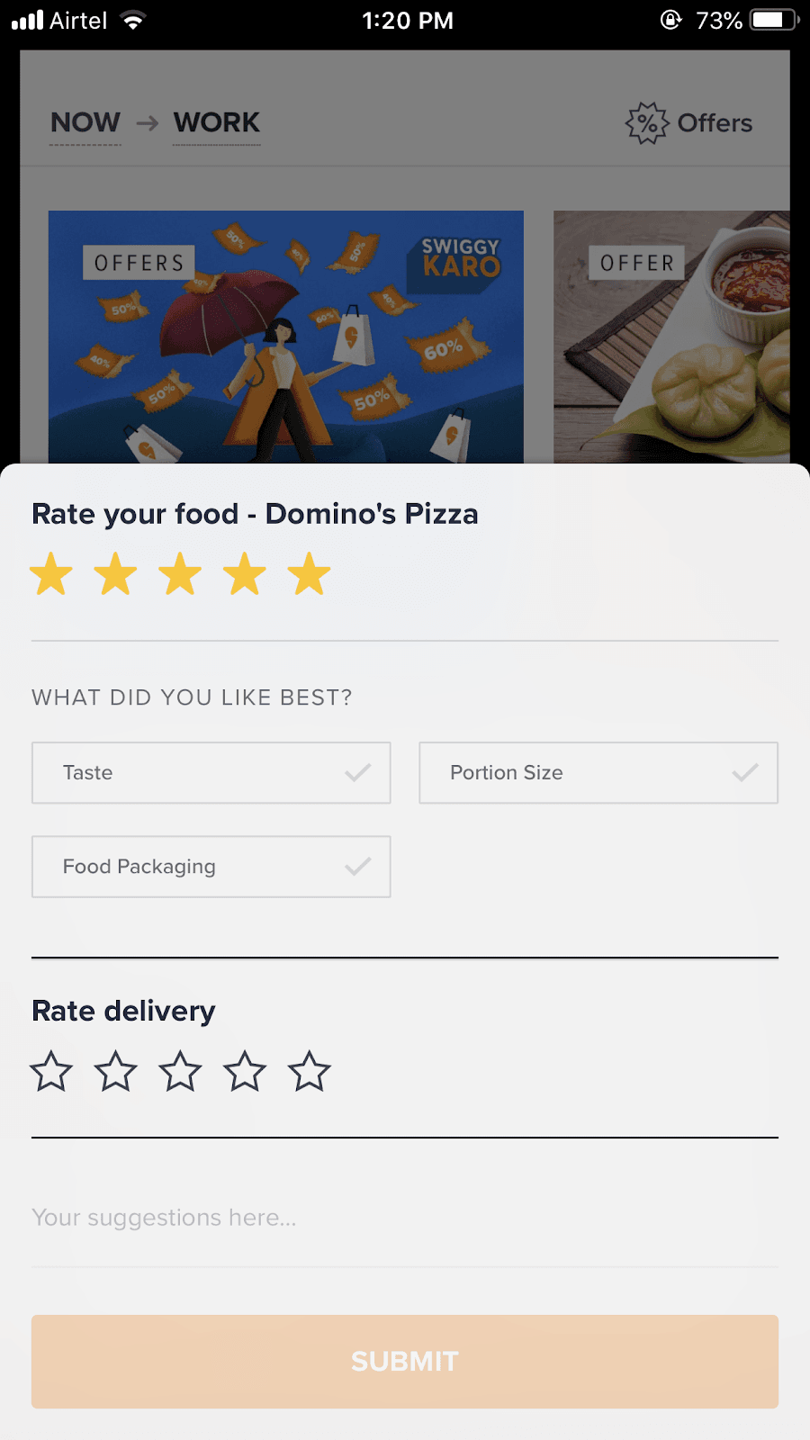
- Feedback from user - rate etc
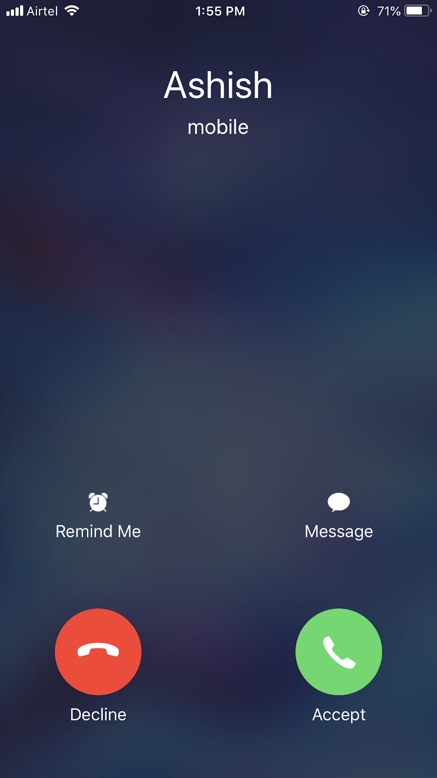
4. Hinting & Affordances
Helping users see the potential effects of their action
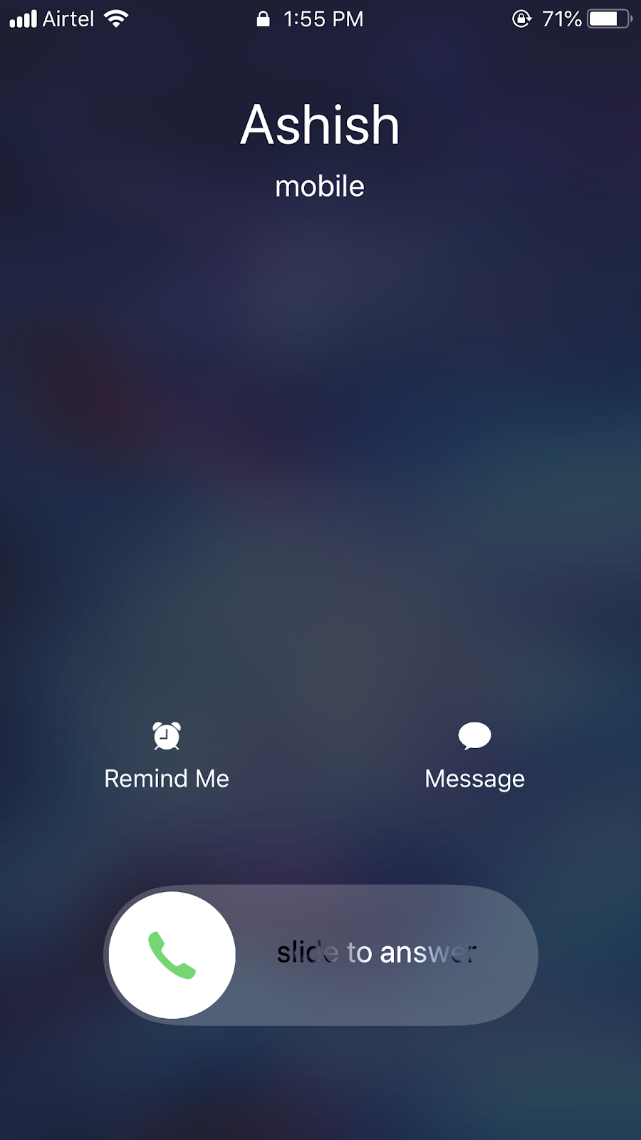
- iPhone slide to answer to pick the call, when the phone is locked to prevent accidental click and hint user on to how to pick the call. Whereas when the phone is unlocked, they show accept” button on the bottom right corner in the natural zone.
5. Guiding Task & Delightful experience
Showing effect and cause and cueing current or potential actions
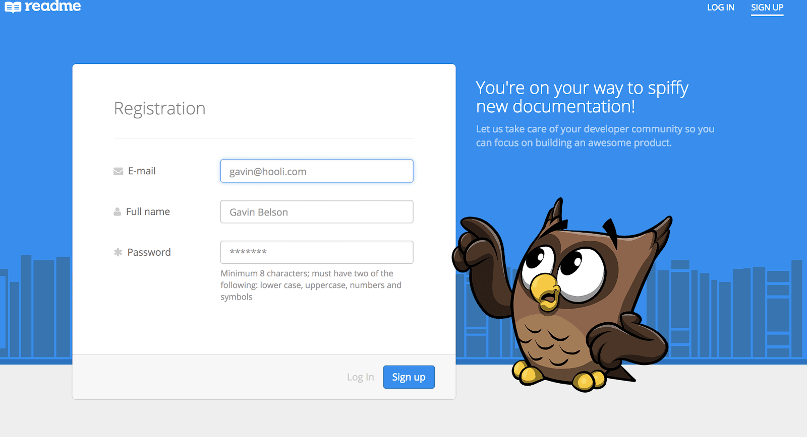
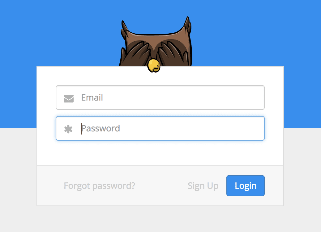
- Read me the login screen
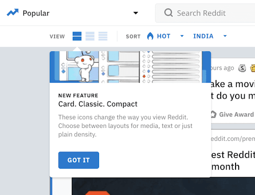
- Reddit guiding - user about features, also in Behance once user login
6. Directing Attention
Calling attention and Leading the eye to changes and important items
- Fitbit ios app - showing the stats
- Codepen save the changes animation
7. Perceived Performance
Animation can make unavoidable waits seems shorter
- Fitbit ios app - showing the stats
- Skeleton content to make the user feel that content is loading
- Loaders
- Progress bar (Duolingo)
- Customized loader design (Airbnb)
8. Storytelling & Messaging
Voice and tones come through in motion too
- Apple website menu bar
- Onboardings
Interface Animation
Animation refers to creating the impression of motion. Disney’s Principles produce ‘more appealing animations,’ the UI Animation Principles result in more practical experiences.
Further reading click here.
There are various types of Interface Animations:
1. Micro-interaction
Micro-interaction is like your health - you will not notice it when it works properly but will understand its importance when something goes wrong. Microinteractions enabled by interface animation are also hardly notable for a user until the moment when they face the problem of their absence.
Major types of micro-interactions:
- Animated buttons - is a frequent trigger even for a low level of computer literacy group, because it imitates real-life interaction.
- Pull-down-to-refresh - reinforced mental models on the app
- Preloaders - Keeps the user interested and make the user believe the net is slow
Take away
- It shouldn’t be too long and annoying
- Works for target user on different devices
- Shouldn’t be a high distraction
- Should be the stylistic concept of the application or website ( when user see custom loader the app it makes them believe that content is loading soon)
Example
- Instagram “Like” button
- Airbnb keeps an anywhere in location for search
- Zomato floating menu button on the restaurant page
- Hugeinc hidden nav links
- Facebook react feature
2. Animation showing the process/path to process
Such animations help users/show the stage of the processes
Example
- Swiggy order is placed “Tick animation” / “Track order”.
- On Website page side scroll - help the user know where he is now ( Medium articles )
- Duolingo progress bar and gamification
3. Clarifying/Explanatory Animation
These are popular in tutorials and tooltips, to explain complicated operations
Example
- Slack old brand explanation video.
- Logo brand video/ animations
- Medium - our story video
- Swiggy-pop opening animation ( while loading feels like something popping out)
- Mouse animation of websites
- Tooltips
4. Decorative Animation
Decorative Animations are often used to create original and engaging user interface design experience, catchy and bright
Example
- Hubspot.com ( avatar and animation)
- Snoopdogs.dogstudio.co
- Gameoftheyear.withgoogle.com
- soul.games
- middlechildphilly.com
- Tooltips
Example & Purpose of Interface Animations
1. Showing that process is progressing (App & Web)
Microinteractions are the best as they offer a variety of choices like Animated buttons, Pull-down-to-refresh, and Pre-loaders. Animated buttons is a frequent trigger even for a low level of computer literacy group because it imitates real-life interaction. (Example: Bira website). Pull-down-to-refresh reinforces mental models on the app and Pre-loaders keep the user engaged and make the user believe the speed of the internet is slow
2. Showing that the action is done (App & Web)
For instance: Hamburger menu icon with transition animation and Billing gateways buttons.
3. Grouping the data (App & Web)
This is achieved using Clarifying and Decoratives. For Example, The menu in food apps like Uber eats single page grouping converting the categories is header nav.
4. Drawing attention to a specific element (App mostly)
A great example of this can be the Myntra app product carousel.
5. Providing a prompt to the user (App mostly)
Microinteractions, give the user a clue. Mostly navigation ( google maps) they need to be suitable enough not to overwhelm the user but still be on point.
6. Supporting general style and branding (Web mostly)
Microinteractions and Decorative greatly achieve it. For Example, Uber cards styling, swipe up, Mascots, Logo, etc.
6. Keeping consistency of transitions (Web mostly)
Decorative in Invision design genome project modal and Invision design -better website
7. Shock and Awe (Web mostly)
Make users curious to try, move things toward outward. For instance, Twitter splash screen, Word of the day page change interaction, Swiggy splash screen, and nikka.com.au
Real-time and Non-realtime interactions
1. Real-time Interactions
In this kind of interaction, the user is directly interacting with the object in the UI
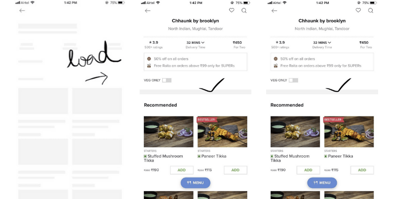
- Swiggy card scroll is a good example of real-time interaction. The way we press and scroll it card behaves similarly. Here, input and output are real-time.
2. Non-Real-time Interactions
It occurs after user action and is transitional mostly with a load time/ lag
- Swiggy restaurant list - on clicking the page is loaded with content ( it is transitional with stages like Onclick -- load -- final result )
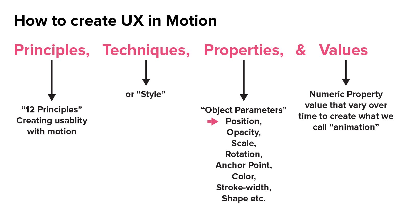
How to create UX in Motion
Below mentioned are the 12 Principles of Creating Usability with motion.
1. Easing (Shown in and Slow out)
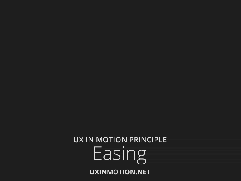
Disney refers to this as “Slow in Slow out”. It creates and reinforces the “naturalism”. All interface objects exhibit temporal behaviors, ease. Objects in the real world, like the animals, human body, vehicle, etc. need time to accelerate and slow down. E.g., sitting down, standing up, object movement be real-time or non-realtime
The irony is that where linear motion is vastly “simpler” and easier to grasp, it is the non-linear, more complex motion that we are adapted to and which ultimately affects the quality of the user experience.
E.g., Moving humans, if we move with straight feet, without a weight shift, the movement will not be real.
2. Offset & Delay ( Follow through and overlapping action drag)
Follow-through is the way the body continues to move after the body stopped at a point, whereas Overlapping is the offset between the timing of the body and other parts.
In this principle - even before the user registered what objects are, the designer had already communicated to her through a motion that the objects are somehow “separate”. This is extremely powerful. The usefulness of this principle is that it pre-consciously prepares the user for success by informing the user about the nature of the object in the interface. E.g., Tasks app - Add a new task button functionality
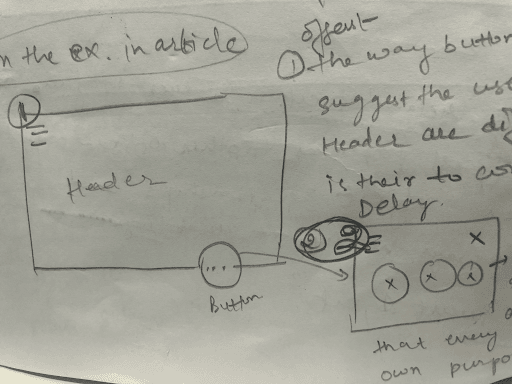
In fig 1 - Offset
The way button appears to trigger suggests the user that button and header are different, and the button is there to complete its functionality.
In fig 2 - Delay
Once the button is triggered, the way different circles animate suggests that every circle has its purpose.
Implementation of this Principle
- Parallax effect: The overlapping content will often “float” over the content it comes as you scroll. For example,
- werkstatt.fr
- Restaurantleduc.com
- Invision: genome project
- Variable shadow effect: Apart from the actual physical properties of light, you’d expect staked elements to have different shadow spreads.
- UI Callout: Use the overlapping image to call out a piece of UI.
- Context Images: Background content is a photo to set the mood. This makes sense because of the overlapping obscuring it. For example Hugeinc ( image sections)
3. Parenting
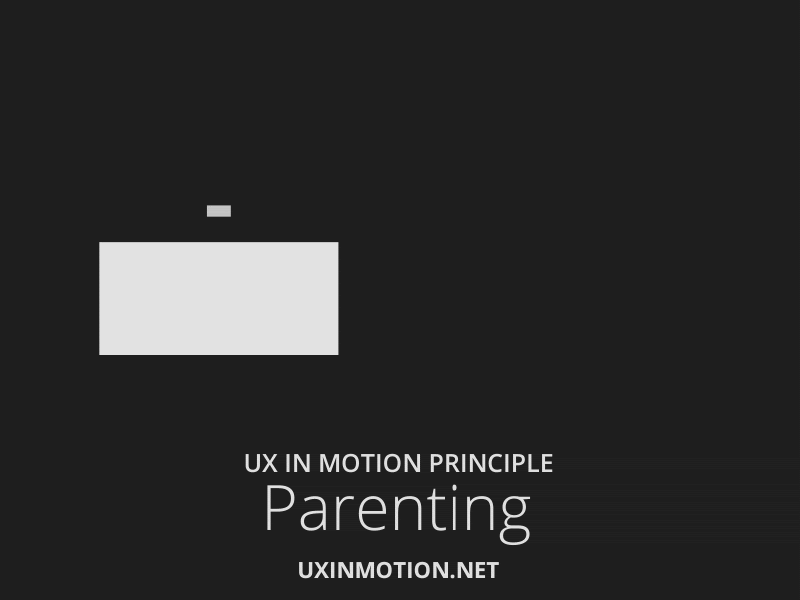
This is the principle that “relates” objects in the user interface. It is the linking of object properties to other object properties, which creates object relationships and hierarchies in ways that support usability. The “Child” object depends upon the “Parent” object
Parenting is of three types:
1. Direct Parenting

The child object depends on the parent object.
2. Delayed Parenting
When the parent object is triggered and child object functions accordingly but with a delay.
3. Inverse Parenting
Message right swipe on iPhone.
4. Transform
It creates a continuous state of narrative flow when object utility changes. E.g., Button with different shape changes at different stages, payment buttons.
5. Value change

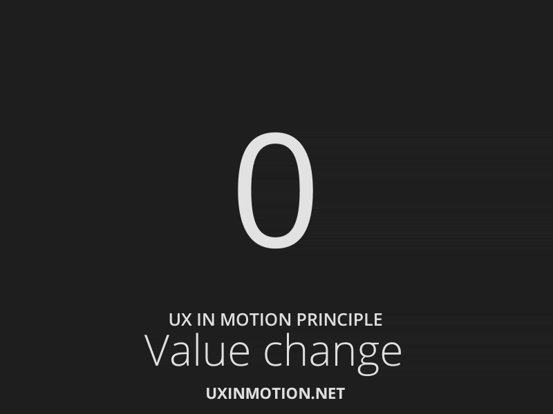
In the real-time event, the user interacts with the object to change values. E.g., setting the alarm. In the non real-time event, such as loaders and transition, the values change without user input to reflect a dynamic narrative. Eg. stopwatch
6. Masking ( Dribbble Ashish Chandran)
In “Dynamic” design, masking creates continuity in an interface or object group when the utility is determined by which part of the group or object is canceled or revealed. E.g., is app icon in phones is masked to open an app.
7. Overlay ( Dribbble Ashish Chandran)
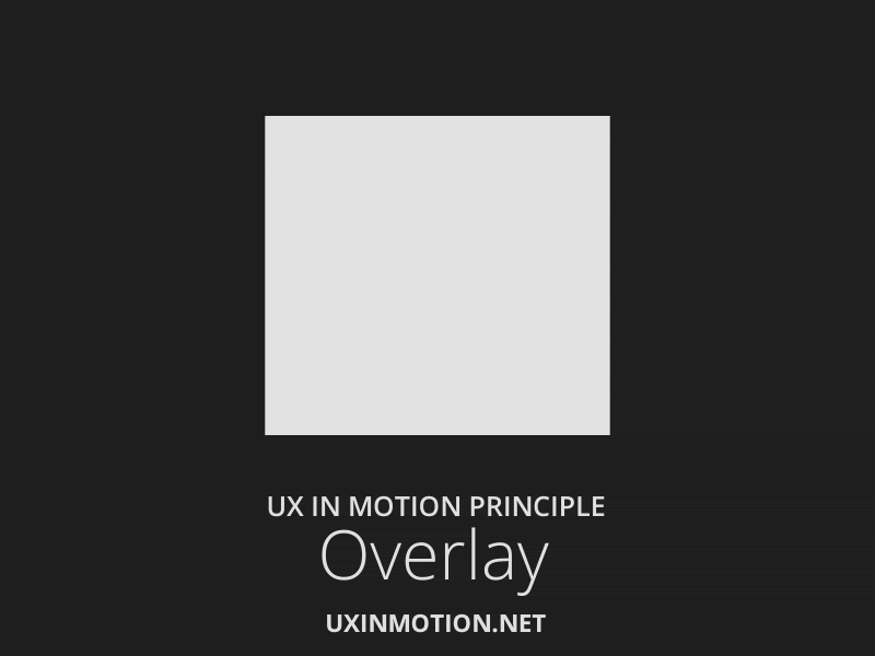
It Creates narratives and object spatial (relating to or occupying space) relationship in visual flatland when layered objects are “location dependent” and converts non-3D space into one. E.g., word of the day page over page animation
8. Cloning
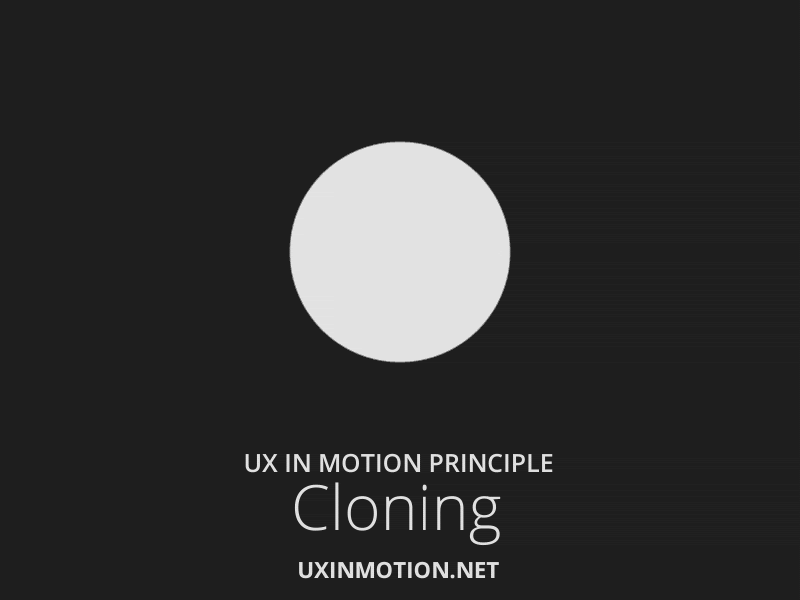
- Creating continuity, relationship, and narratives, when new object originates and depart.
- Cloning works with masking and dimensionality.
- E.g., how we can make different options out of a single float button.
9. Obscuration ( Virgil Pana Dribbble)
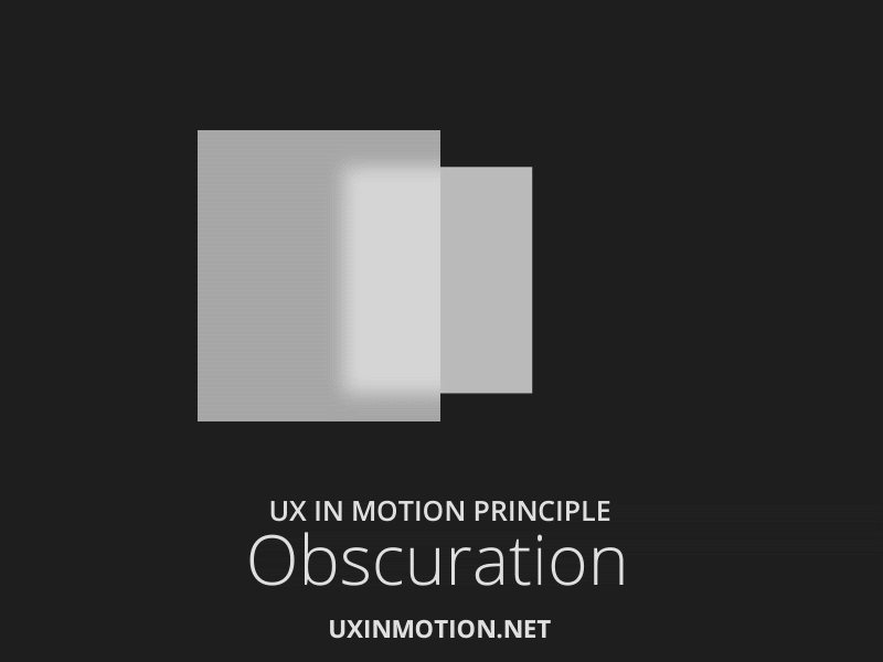
It is a static & temporal phenomenon that allows the user to spatially orient themselves with scenes or objects, not in the primary visual hierarchy. Eg. App icon on iPhone, long press gets obscuration layer with many actionable.
10. Parallax ( Aestic Veil Dribbble )
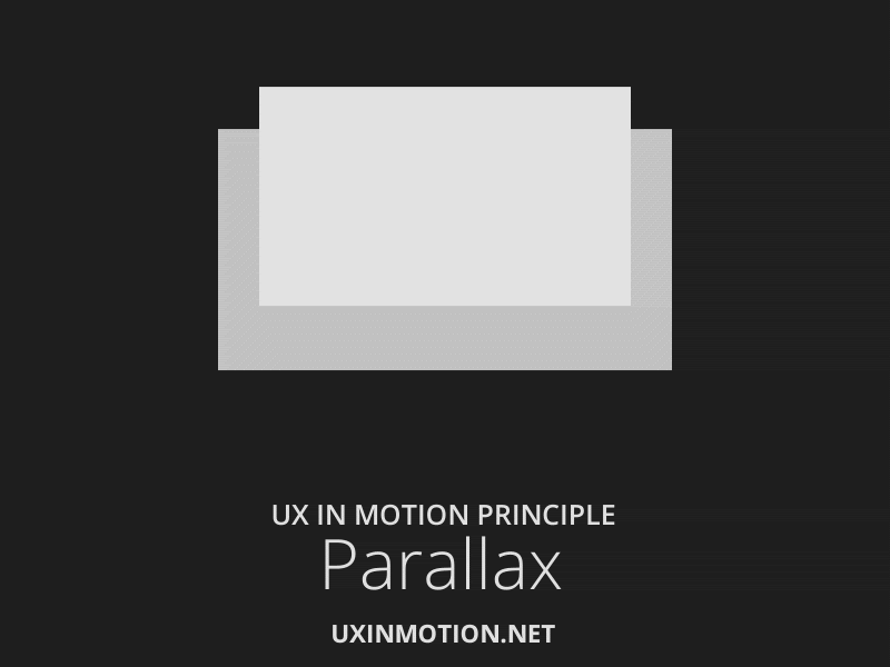
Parallax allows the user to focus on primary actions and constant while maintaining design integrity. It is simply different interface objects moving at different rates.
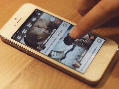
11. Dimensionality ( Virgil Pana, Eddie Lobanovskig Dribbble )
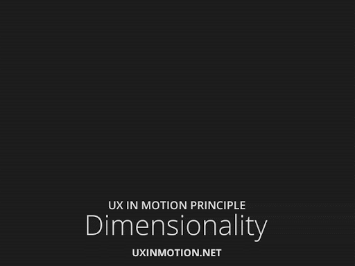
It Provides a spatial narrative framework when new objects originate and depart and overcome the layering paradox in a visual flatland where objects lacking depth exist on the same plane but occurs “in front of ” or “behind” other objects.
Dimensionality is presented in three ways
1. Origami
3D interface object, multiple objects combined into origami structures the hidden object still can be “exist”. Eg. news in short app primary animation.
2. Floating
Gives interface objects a spatial origin and departure, making the interaction models intuitive and highly narrative.
3. Object
Results with true depth and form.
12. Dolly and Zoom
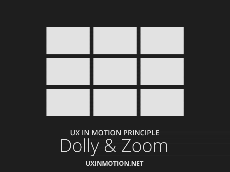
Dolly is a film terminology and applies to camera movement either away from a subject or towards it. Dolly also involves dimensionality, in more spatial experience, more depth, and communicating to the user additional areas or content that is “in front” or “behind” the current view. Eg. opening apple phone old style
The event where neither the perspective nor the object is moving spatially, but rather the object itself is scaling is called zooming. This communicates to the views that an additional interface object is “inside” other objects or scenes. It allows seamless transitions - both real-time and non-real time animation. Eg. gallery apple phone
People are also reading:
- 10 Best Graphic Design Books
- Best Graphic Design Books For Beginners
- Top UX Design Courses
- A Day with Design Sprint
- Top Python Certification
- How to Become a Web Developer?
- Software Developer Salary
- Data Analytics Certification